Although a combination of colors might look stunning on an outfit for a night’s out, it might not be exactly the right choice for your walls and furniture. Color has its own science, and it’s part of what interior designers study, so that they can create for you the perfect color palette for your home.
You don’t actually need to study for years and specialize as an interior designer in order to be able to create a color scheme for your home. A lot of people do it themselves with perfect results.
However, other people actually succeed in messing it up, and the result is a chaotic home that doesn’t provide the necessary level of comfort, or doesn’t make you feel good. That is actually quite normal, since it’s not easy to pick the right colors that go well together.
After you read this article, you will know everything about color theory and you will be ready to go and bring colors to your home and make it dazzling.
What is Color Theory
Don’t worry, it’s not like theory in math or anything, it’s just the study of how colors fit together. It will tell you why a certain color perfectly complements another one, while other nuances simply are not a good match.
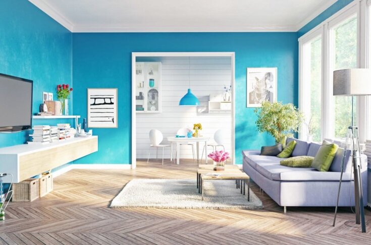
The main thing you need for it is the color wheel. Any two opposing colors on the wheel are contrasting. They are called complementary, and they will always look well next to one another and each one will make the other one look even brighter and more saturated.
Except for using complementary colors, you can use the color wheel to create all sorts of different color schemes that will bring your interior to life.
Monochromatic Scheme
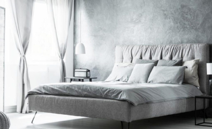 “Mono” means one, and “chrome” means color, as they both come from Greek. The monochromatic palette includes a single color in different nuances, hues and shades.
You will be surprised to discover how different two nuances of the same colors can look, so you could actually create a vast variety using only one base color.
A monochromatic palette could also include mainly neutrals and one single bright color as an accent.
Analogous Colors
The analogous colors are those colors who sit next to each other in the color wheel. These could be for example purple and blue, green and yellow, orange and yellow, and so on.
You can actually build a color scheme with more than two analogous colors to create a sort of ombre effect. A good tip is to pick one color for the fixed elements and complement them with the other colors from your chosen palette.
Complementary color scheme
The complementary colors, unlike the analogous, stand right across each other on the color wheel, as was mentioned earlier in the article. Complementary couples include blue and orange, purple and violet, and red and green.
Complementary colors do not only include the primary colors, but also all their tones and nuances. For example, instead of orange you could use muted ochre and it would still go well with blue.
Triple Color Scheme
A triple of a triadic color palette includes three nuances that are distanced equally on the color wheel. These could be red, yellow and blue for example, or green, purple and orange.
The three equally distanced colors will always be a good match and complement each other. Just be careful not to use different nuances too much. Pick a main one and let it stand out the most to create a sort of hierarchy between the different colors.
Tetradic
The tetradic, or the rectangular scheme, is similar to the triadic one, but it includes four colors that are also evenly distributed across the wheel. If you connect them with lines, a rectangle would appear, hence the name “rectangular scheme”.
That is a bit complicated palette to use, since it includes a variety of tones and it is easy to get it messed up. If you are not a professional interior designer it is best if you stick to the simpler schemes, because they allow you to produce stunning palettes with a great variety of tones and small chances for mistakes.
Neutrals
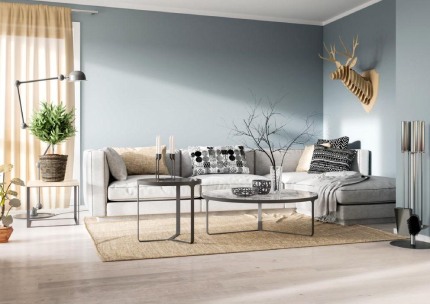 Besides the vibrant colors of your palette, it is important to also choose the correct neutrals that would act as a base. It is not a good decision to use vibrant colors everywhere in the room.
Rather, it would look a lot better if there were some default neutrals and the colors were only present in certain areas. Neutrals could be warm or cold whites, as well as different shades of grey.
The neutrals you pick could have the undertone of your main color, or an undertone that is in the complementary color of the main color of your pallete.

My name is Scarlett Mitchell and i am an author and editor in the home topic website – FemCasa.com.
I’m just an enthusiast who wants to share her visions, ideas and advices, when it comes to decorating every part of your home until it becomes the perfect relaxing place for you and your family.